
Design ROI for Commercial Spaces: How Atmosphere Drives Revenue, Retention & Wellness
The Bottom Line
In commercial environments, whether retail, office, or service-based, thoughtful design directly impacts your bottom line. Better wayfinding reduces customer friction. Strategic color choices influence purchasing behavior and employee mood. Daylighting boosts productivity and cuts energy costs. This isn't theory; it's measurable ROI.
We've spent over a decade perfecting design principles in residential spaces. What many don't know is that we also bring significant experience to commercial environments: retail, office, and service spaces. Today, we're sharing the design principles that drive ROI in commercial settings, whether you're designing a new space or reimagining an existing one.
1. Wayfinding: The Invisible Profit Driver

Think of wayfinding like a well-maintained trailhead. Direction is clear, and while there may be off-shoots, the confidence of remaining on the trail provides clarity
Most people don't think about wayfinding until they can't find what they're looking for.
Wayfinding is the art and science of helping people navigate a space intuitively. Poor wayfinding creates friction: customers leave without buying, employees waste time searching for conference rooms, and patients feel anxious in healthcare settings. Good wayfinding feels invisible; people move through the space naturally, confidently, and spend more time (and money) there.
Why it matters for ROI:
Retail: Customers who can easily find products stay longer and spend more. Studies show clear signage and logical layout increase average transaction value by 10–15%.
Office: Intuitive navigation reduces stress, improves collaboration, and cuts down on "where's the bathroom?" interruptions. Employees in well-wayfinded spaces report higher satisfaction.
Service industry: Clinics, salons, restaurants. Clear wayfinding reduces perceived wait times, prevents frustration, and builds confidence in your brand.
Design principles:
Consistent visual language (color, typography, iconography)
Logical spatial hierarchy (main paths vs. secondary areas)
Strategic sight lines (can you see where you need to go?)
Minimal cognitive load (don't make people think too hard)
The best wayfinding systems feel so natural that customers don't notice them. They just flow through the space.
2. Accessibility: Design That Works for Everyone

Going back to our forest trail - a boardwalk provides comfort and confidence when walking through muddy and uneven trails, just as physical space and clear direction provides comfort in retail environments. Photo by Markus Spiske: https://www.pexels.com/photo/light-landscape-nature-forest-117843/
Here's something most people don't talk about: poor accessibility isn't just inconvenient for people with disabilities—it creates discomfort for everyone.
Walk into a retail space with narrow aisles, unclear signage, and confusing layout. You might not have a mobility device, but you feel the friction. Parents with strollers, elderly customers, people with cognitive disabilities, non-native speakers—they all experience the same discomfort, often more acutely. And they leave.
On Vashon Island alone, there are several beloved local spaces that I personally avoid because the design simply doesn't work for comfortable navigation or use. The irony? These spaces could be just as beautiful and functional with thoughtful accessibility design.
Why accessibility matters for commercial ROI:
Expanded customer base: Accessible spaces welcome aging populations, parents, people with disabilities, and visitors unfamiliar with the space. That's a larger market.
Better experience for everyone: Wide aisles, clear signage, logical flow, good lighting—these benefit all customers, not just those with disabilities.
Reduced liability: ADA compliance is the baseline; thoughtful accessibility design goes beyond legal requirements.
Brand loyalty: Customers remember how a space made them feel. Accessible, comfortable spaces build loyalty.
Design principles:
Clear wayfinding with multiple cues: Not just signs—use material changes, lighting, color, and spatial logic to guide people intuitively
Adequate space and flow: Wide aisles, turning radiuses, seating areas that don't force people to stand
Accessible entrances and bathrooms: Ramps, automatic doors, accessible stalls—these should feel integrated, not like afterthoughts
Lighting for visibility and comfort: Good contrast, glare-free lighting, and options for people with light sensitivity
Sensory considerations: Acoustic design for those with hearing aids, low-VOC materials for those with chemical sensitivities
Our approach: As a Certified Living in Place Professional, I've spent years designing spaces that adapt to how people actually live—aging in place, accommodating disabilities, supporting diverse needs. These principles apply equally, if not more so, to commercial environments. Accessibility isn't a constraint; it's an opportunity to create spaces that work beautifully for more people.
3. Color Psychology: The Subway Yellow Case Study
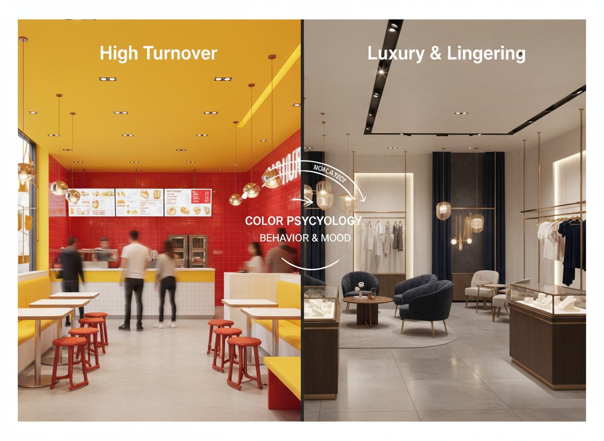
Subway's iconic yellow is a masterclass in color strategy—and its limitations.
Why Subway chose yellow: Yellow draws attention, creates energy, and stimulates appetite. It's warm, approachable, and memorable. For a quick-service restaurant designed around fast transactions, yellow is perfect. It says: "Come in, order fast, move on."
The trade-off: Yellow is also overstimulating. Spend 30 minutes in a Subway, and you'll feel it—slight agitation, fatigue, a subtle urge to leave. This is intentional. Subway doesn't want you lingering; they want throughput. High-energy color = high turnover.
What this teaches us: Color isn't just aesthetic—it's behavioral. Your color choice should match your business goal:
High-turnover retail (fast food, quick service): Warm, saturated colors (yellow, orange, red) create urgency and appetite stimulation.
Luxury retail or fine dining: Neutral, muted palettes (grays, warm whites, deep jewel tones) signal quality, exclusivity, and encourage lingering.
Office environments: Cool, balanced palettes (soft blues, greens, warm grays) reduce stress and support focus.
Healthcare: Soft, nature-inspired colors (pale greens, warm neutrals) create calm and trust.
4. Daylighting: The Productivity Multiplier

Okay, maybe not the best representation of productivity
Photo by Leah Newhouse: https://www.pexels.com/photo/brown-cat-540532/
This one has hard data behind it.
Employees in naturally lit offices show:
15–25% higher productivity (University of Michigan study)
Better mood and reduced depression (Harvard research on circadian rhythms)
Fewer sick days (access to natural light supports immune function)
Lower energy costs (reduced reliance on artificial lighting)
Yet many commercial spaces are still designed with minimal windows or interior zones cut off from daylight. This is a missed opportunity.
Why daylighting matters for commercial ROI:
Office: A 15% productivity gain translates directly to output. For a 50-person office, that's the equivalent of adding 7–8 full-time employees—without hiring costs.
Retail: Customers perceive naturally lit spaces as cleaner, more trustworthy, and higher quality. Daylighting also reduces energy costs, improving margins.
Service industry: Salons, clinics, and restaurants with good daylighting feel more welcoming and professional.
Design strategies:
Maximize window placement and size (consider floor-to-ceiling glass where appropriate)
Use light shelves or reflective surfaces to bounce daylight deeper into the space
Minimize interior walls that block light penetration
Choose light-colored, reflective interior finishes to amplify natural light
Integrate skylights or clerestory windows in interior zones
Pair daylighting with automated dimming to manage glare and heat gain
The LEED and LFA connection: At Waldron Designs, we're LEED AP and LFA certified, which means we understand how to optimize daylighting for both comfort and energy efficiency. The goal isn't just "more light"—it's quality light that reduces eye strain, supports circadian rhythms, and cuts energy consumption.
5. Bringing It Together: A Commercial Design Framework
These four principles—wayfinding, accessibility, color, and daylighting—don't exist in isolation. They work together to create an environment that serves your business goals.
Example: A high-end office environment
Wayfinding: Subtle, sophisticated—perhaps material changes (wood to stone) rather than obvious signage
Color: Warm neutrals, soft blues, natural materials that age gracefully
Daylighting: Maximized with careful glare management; natural light as a design feature, not an afterthought
Example: A retail boutique
Wayfinding: Clear but elegant—strategic lighting and layout guide customers without obvious signage
Color: Curated palette that reflects brand identity; possibly one accent color to draw attention to key displays
Daylighting: Front-of-house maximized; back-of-house controlled to highlight merchandise
6. Why This Matters Now
Post-pandemic, commercial spaces need to work harder. Employees have options; customers have expectations. A well-designed commercial environment isn't a luxury—it's a competitive advantage.
Whether you're designing a new office, renovating a retail space, or rethinking a service environment, these principles apply. And they pay for themselves through improved revenue, retention, and operational efficiency.
We're bringing our residential design rigor to commercial projects. We understand how to integrate wayfinding, color strategy, and daylighting into cohesive, sustainable environments that serve your business. We're currently working on a commercial project that embodies these principles—and we're excited to share the results when it's complete.
Waldron Designs, LLC is passionate about designing spaces rooted in their context and responsive to the natural environment. Are you ready to create sustainable permanence with your home?
GET IN TOUCH!