Misty Isle Connections and Textures
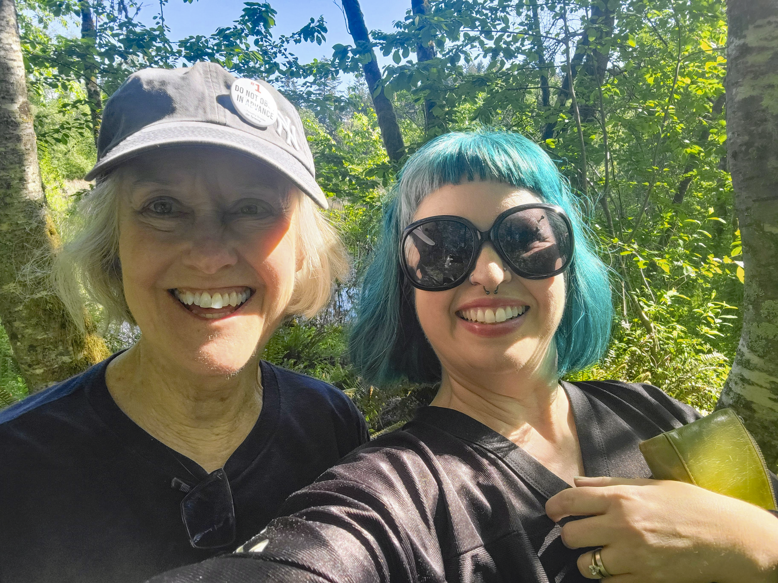
Every other Sunday, I meet my longtime friend, Emily, and we take a nature walk. We’ve been doing this for a few years now, and honestly, it’s done absolute wonders for my mental health. Having that dedicated time with a friend who is so warm, fun, and genuinely good to her core is everything. We laugh, observe the beauty of nature, gossip, and vent about the things that upset us. Emily is one of those multi-talented human powerhouses—she’s a wedding officiant, a yoga instructor, has a degree in library science, and is currently attending the Northwest School of Animal Massage! I couldn't be luckier to have her in my corner.
During our recent stroll through Vashon’s lush trails, I couldn't stop thinking about what nature, deep friendships, and good design all have in common: texture.
We often talk about the layers of a friendship, but texture is just as present. We have seasons where things are smooth sailing, easy, and seamless to connect. Then we have seasons where life gets busy, schedules clash, and the rhythm gets a little rough or unpredictable.
In interior design, texture is the magic ingredient that creates phenomenal interest. You can have a completely monochromatic space (a room filled with a single color palette) that feels rich, grounding, and alive purely because of how the textures play off one another.
So, I thought it would be fun to take the natural textures from our recent Misty Isle nature walk and show you how we’d translate them directly into an indoor living space!
Deconstructing the Misty Isle Palette
When you walk through our local PNW forests, your eyes are constantly processing a dynamic mix of surfaces, lines, and tactile qualities:
Ferns: Smooth, feathery, and horizontal.
Moss: Soft, dense, and tangled—giving off a matte, tactile richness.
Bark: Rough-hewn with deep, ragged cuts running vertically.
Forest Ponds: Glassy, smooth, and reflective, interrupted only by subtle ripples.
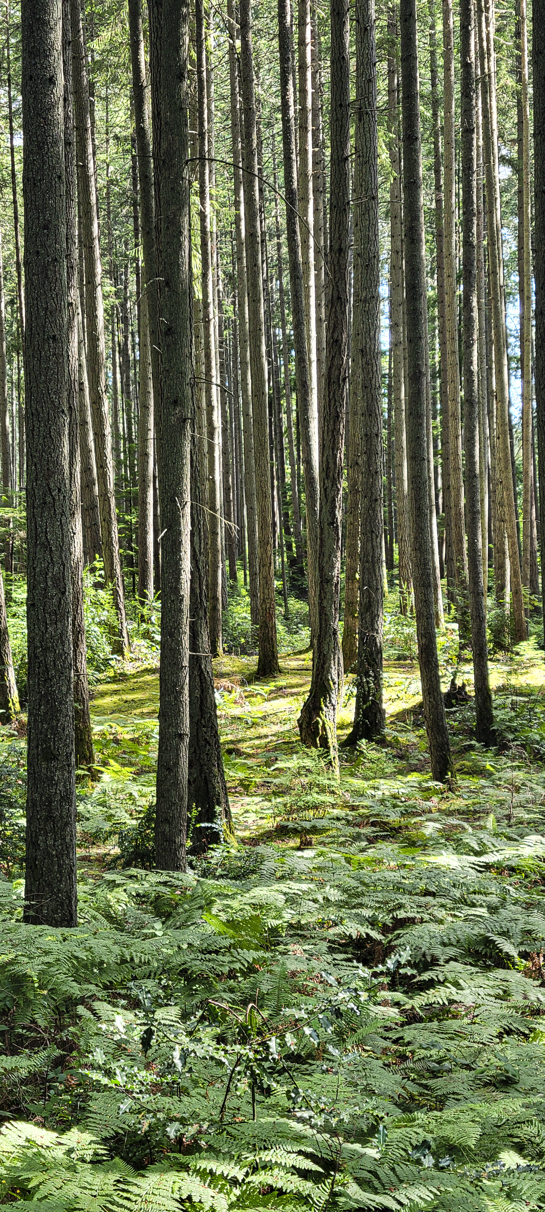
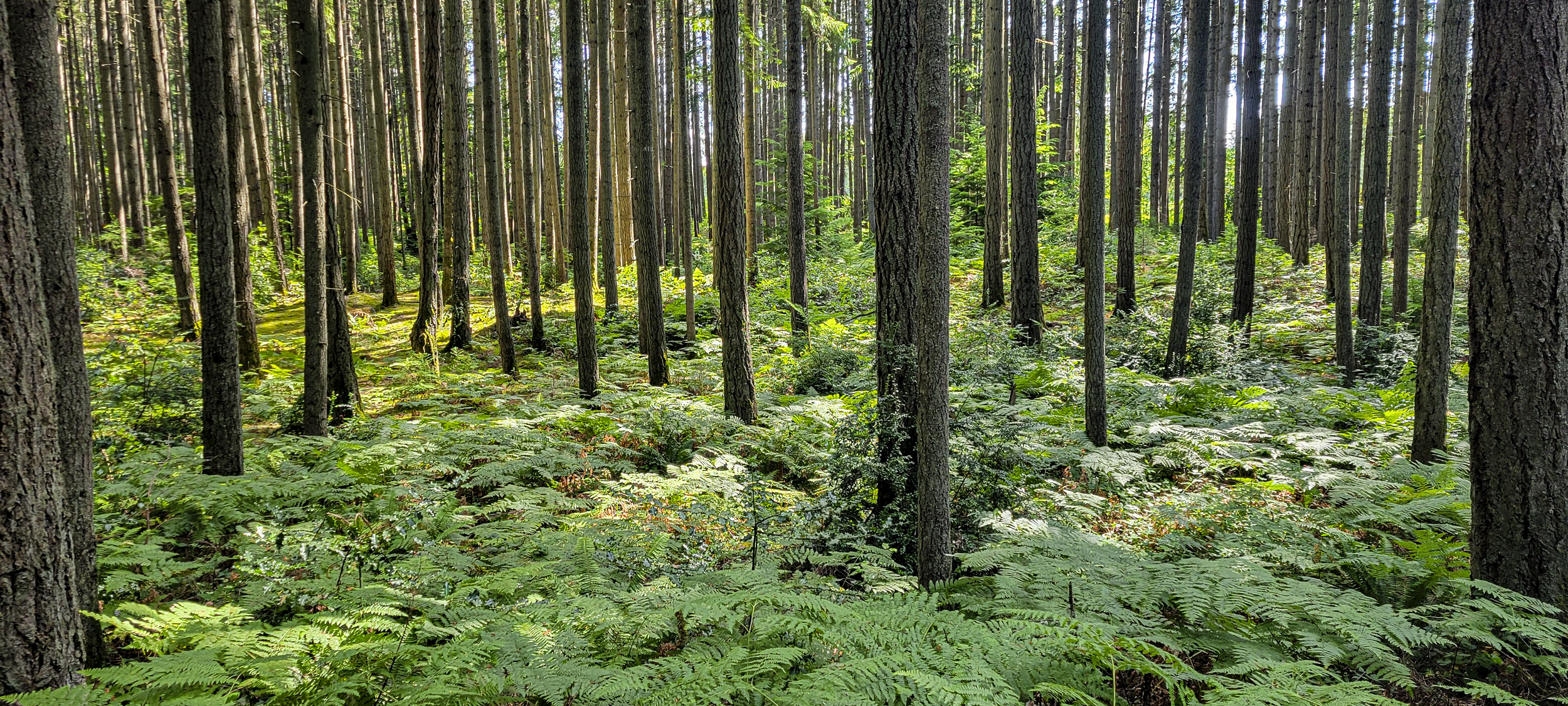
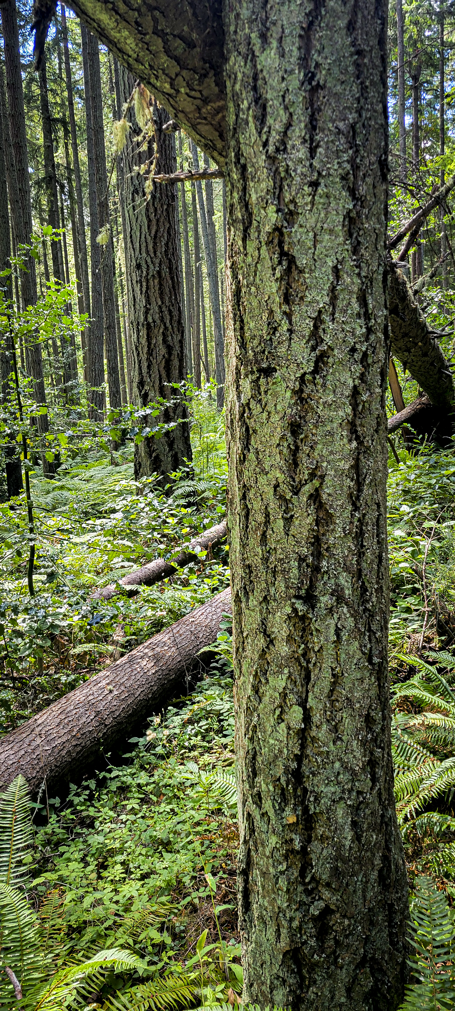
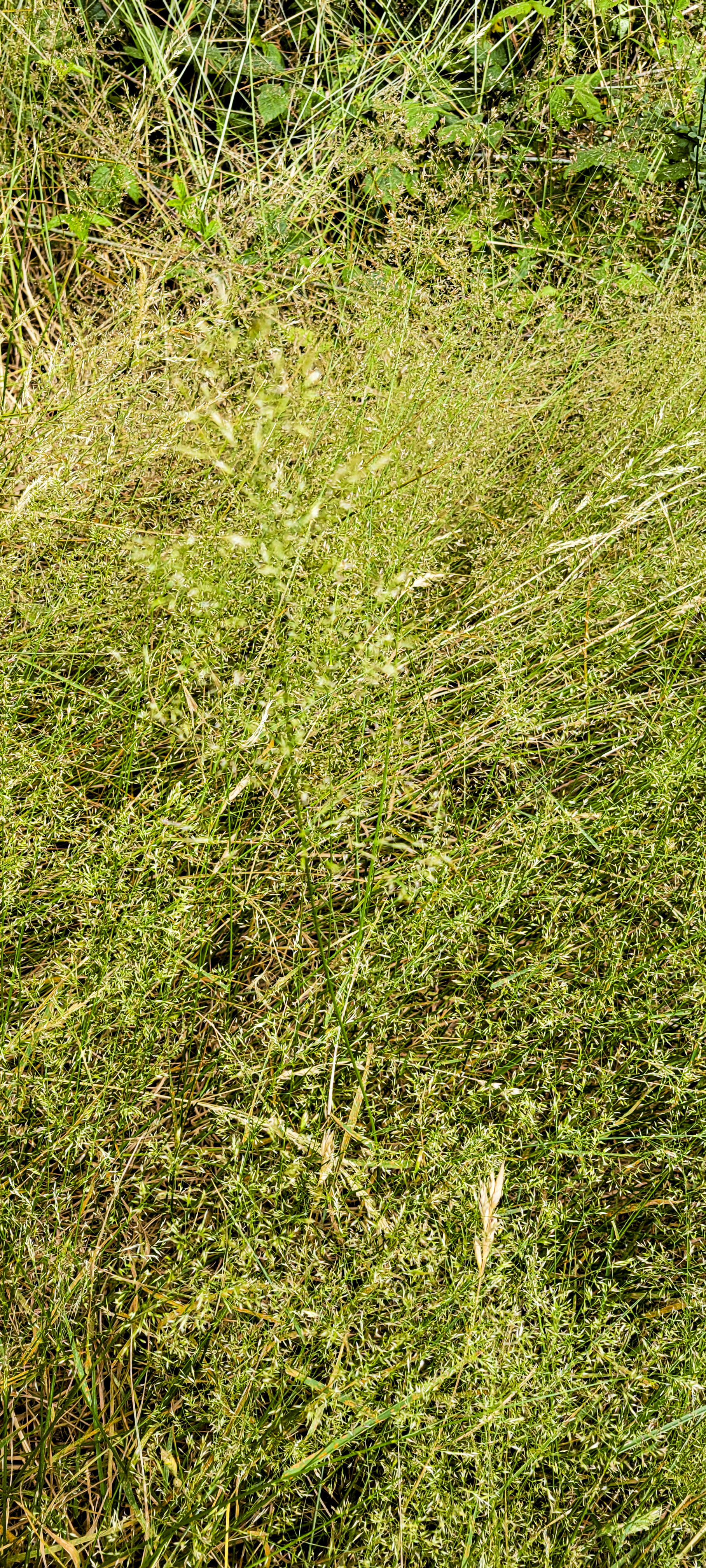
Beyond the surfaces themselves, there’s a beautiful balance of direction and contrast. The low-lying ferns and mosses create strong horizontal ground planes, while the towering trees establish vertical rhythm and repetition. That organic contrast between vertical and horizontal, matte and glossy, rough and smooth, is precisely what makes the forest feel so balanced.
Design Case Study: Reimagining a Local Vashon Kitchen
To put this into practice, I pulled up a local home listing here on the island, described by broker, Sarah Williams at Sotheby’s as, “One of the final developed lots left on Misty Isle, bordered on every side by King County parkland. Sarah is currently listing this home in partnership with Mike Verheran. Step outside and you're fully immersed in nature, peaceful, private, and truly one of a kind” to see how we could bring these exact forest elements inside to elevate the space.
This listing is a multifamily homeowners’ dream come true. Complete with two buildings (each with their own address) a Mother-In-Law apartment in the basement and two RV hookups, this is not just a great opportunity for someone looking to share property with family, but also a great opening for someone who wants property but needs rental income. Did you know that you can qualify for more in terms of loans when you’re renting property out and have a lease already signed?!
Looking at the existing kitchen, a few things jump out:
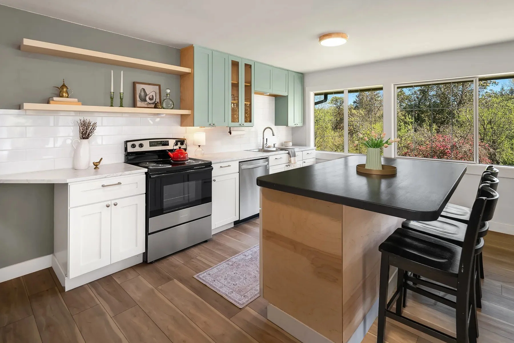
Photo courtesy of Sotheby’s Vashon
Unfinished Contrast: The current kitchen features three different cabinet finishes, which is pulled off quite well, but can feel a bit disjointed, especially with exposed plywood sides on the upper units and island.
The Countertops & Backsplash: The current counters have a beautiful honed finish, which perfectly mimics the soft, matte feel of moss. However, the existing tile backsplash—while glossy—has a dense pattern that interrupts that calm, watery reflection you get from a forest pond.
Imbalanced Visual Weight: In the forest, horizontal ground covers and vertical trunks balance each other out naturally. In this kitchen, the visual weight stops short at the island and doesn't carry across the perimeter wall cabinets.
Our Design Approach
To ground this kitchen in nature’s texture without making it feel overly "themed," we focus on structural balance and honest materials:
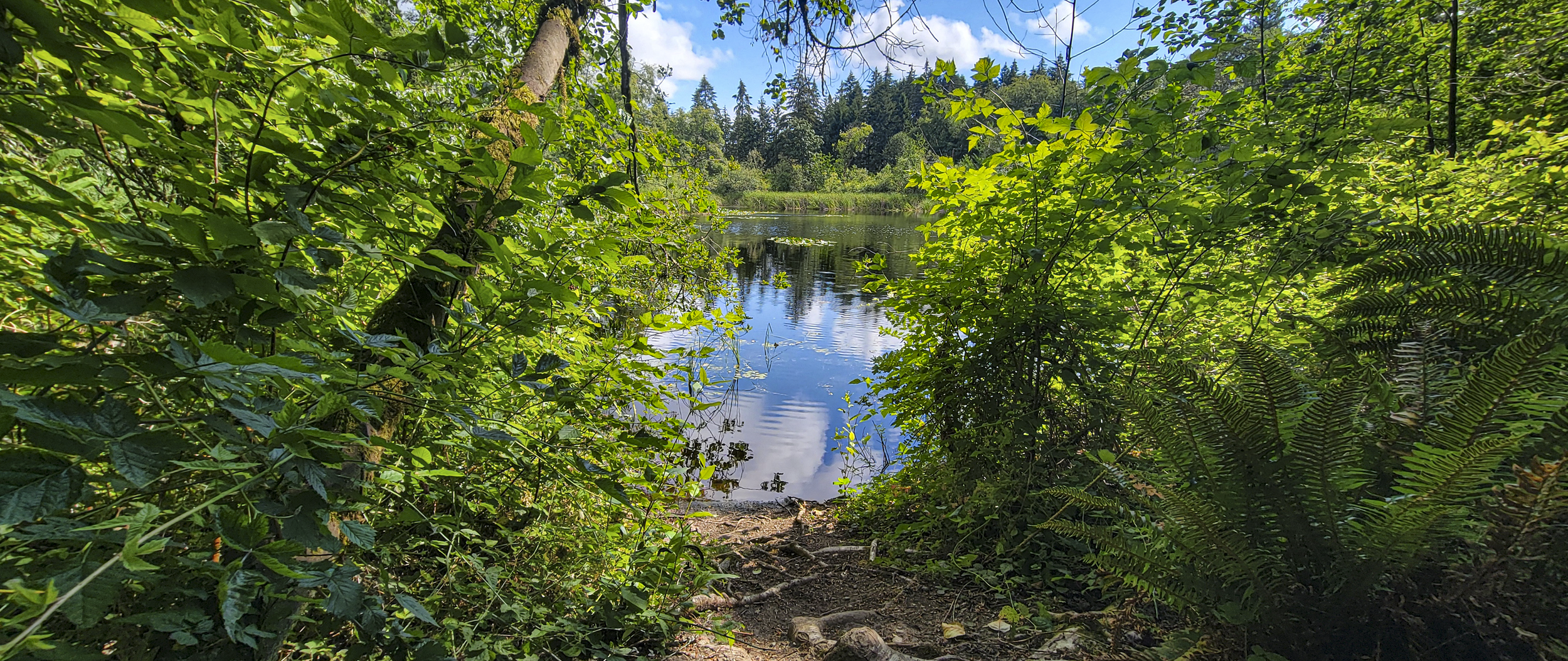
The beautiful mirrored pond at Misty Isle
Emphasize the Horizontal: We keep the countertops smooth, dark, and matte, extending them with purpose to give the space a grounded, solid base (just like the forest floor).
Introduce Rough Wood Grains Vertically: We bring in warm, rich vertical wood grain on the cabinetry (showing a Wood-Mode reeded door) to mirror the repetition and depth of the tree bark.
Swap the Backsplash: Replacing a busy patterned tile with a single, polished slab creates that clean, unbroken, glassy reflection of a calm woodland pond.
The Materials: Bringing the Vision Home
When translating these concepts into real-life specification, we always pull from vendors who meet our standards for transparency, indoor air quality, and low environmental impact. Here are the exact pieces we assembled on our Misty Isle Vision Board:
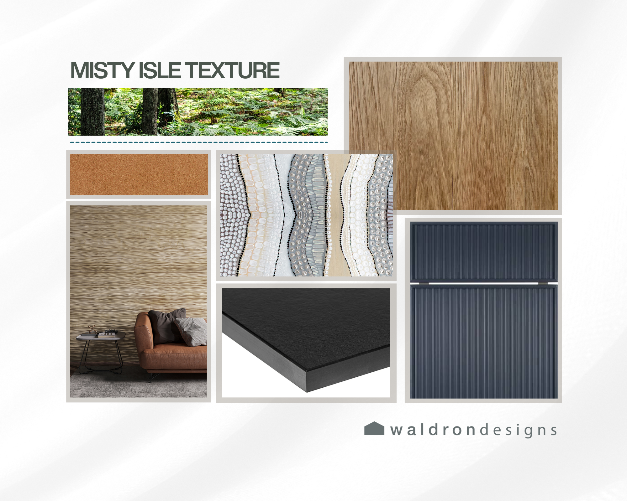
Richlite Paper Counters: Made right here in Washington state, these paper-composite counters offer a smooth, durable, and wonderfully tactile finish with deep PNW roots.
Wood-Mode Cabinetry: To solve the cabinet balance, we specified full-overlay reeded door fronts in a to bring in that essential vertical texture and heirloom durability.
Amorim Wise Cork Flooring: Soft underfoot, sustainably harvested, and packed with subtle, natural texture that quietly ties the room together.
Milton & King Wall Covering (Available directly through our studio!): Perfect for bringing textured pattern to focal accent walls without cluttering the visual field.
Design doesn't have to be complicated, but it should feel intentional. The next time you’re out on a trail, take a closer look at the bark, the water, and the ground cover underfoot. You might just find the exact blueprint for your next home refresh!