Top 4 WhitePaint Colors
Every space is unique and will have specific needs.
Every person has specific tastes.
I may tell you that Oxford White looks great in an east-facing building with a lot of windows (ahem, it looks great in my office!), but a completely different space with different adjacent colors, surroundings, and furnishings may call for something else.
Now that I’ve been diligent in ensuring that we understand that a designer’s love for certain whites does not mean they are the right whites for YOUR space… here we go!
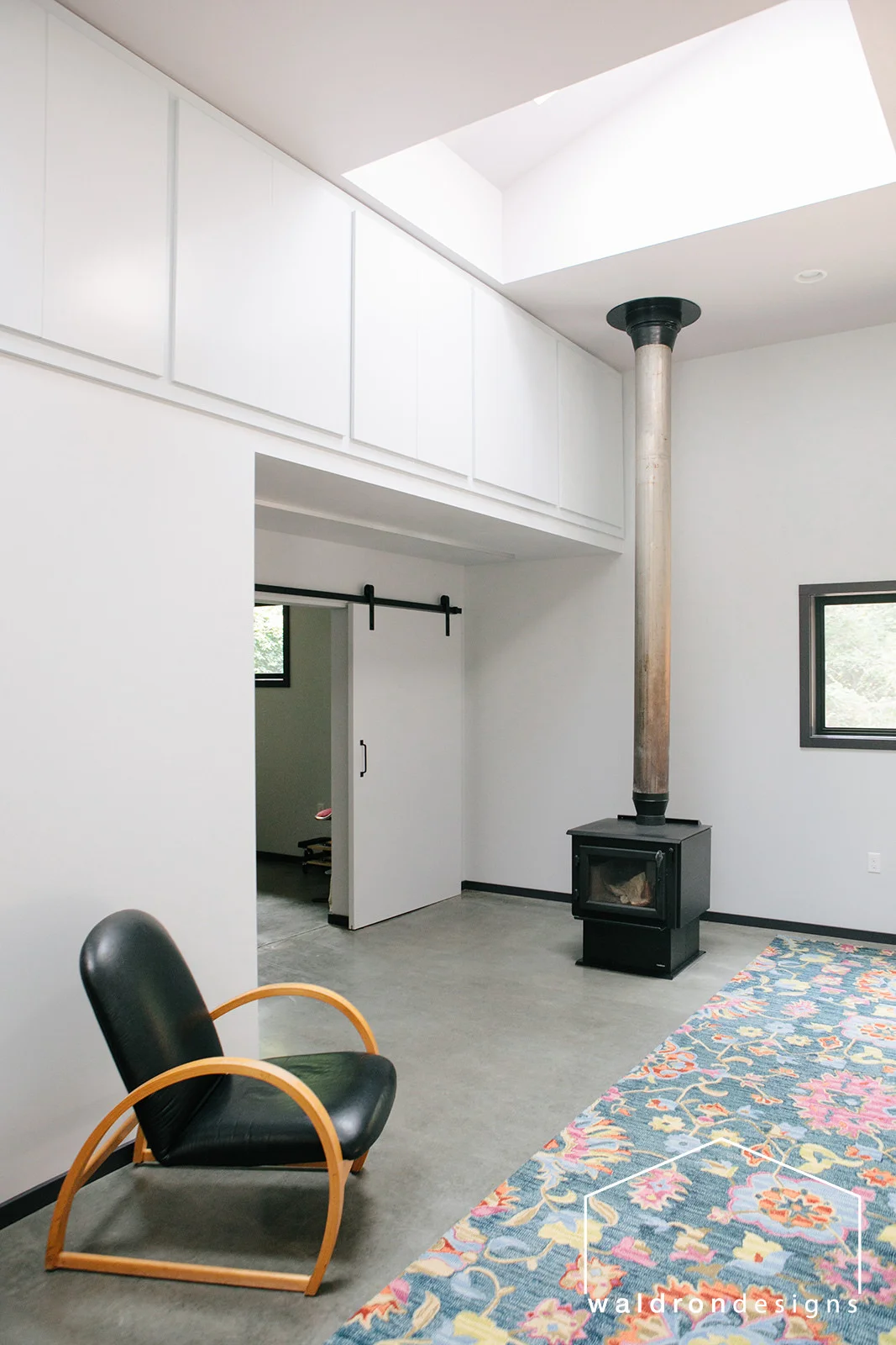
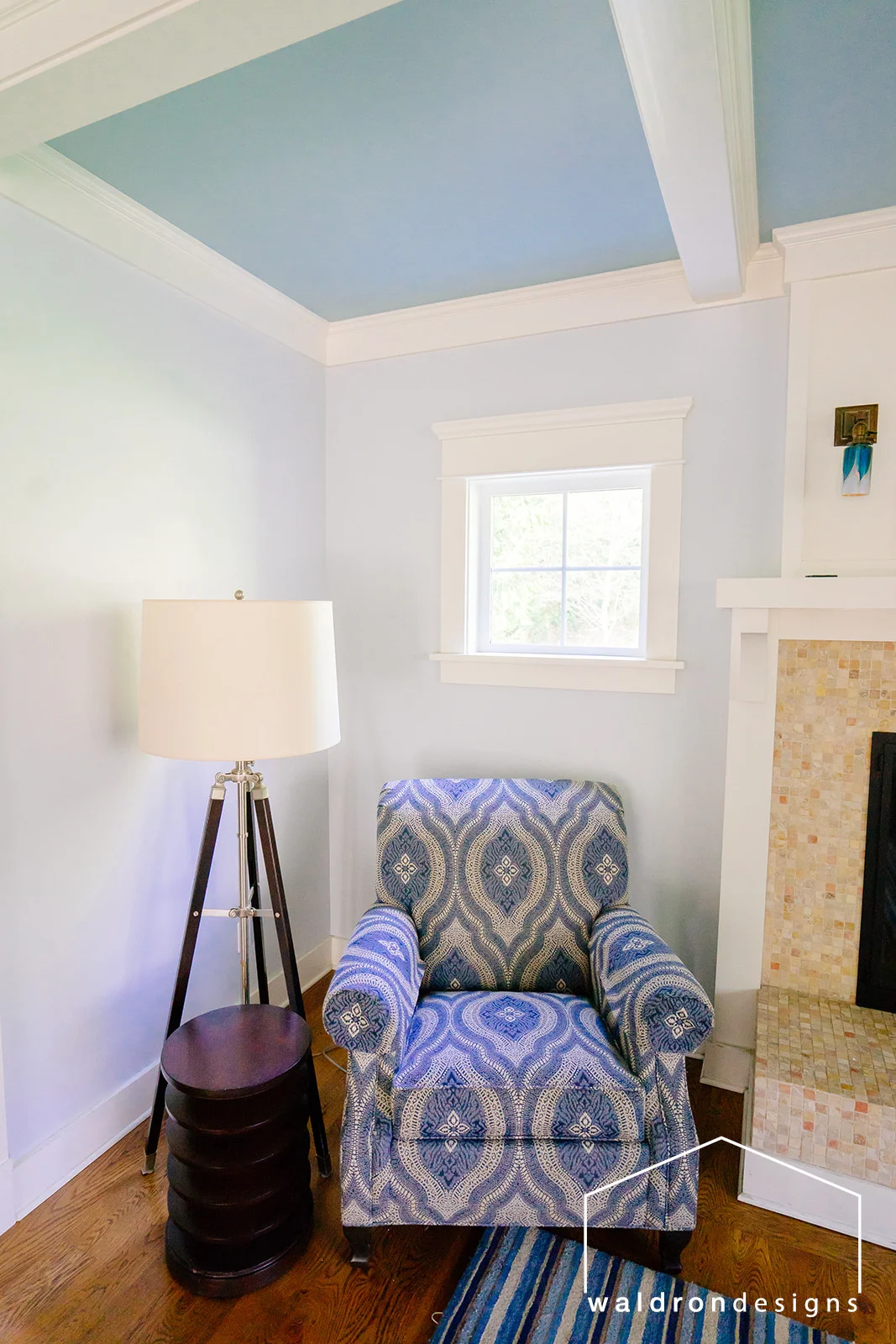
I’m typically a Benjamin Moore fan, simply because of the way they respond well to designers and have great company ethics. Buuuut… I adore this cool white and the way that it picks up on surrounding colors more than any other white I’ve worked with. Take a look at it in my two very different home projects. You would never know that it’s the same white!
olympus white picks up on the surrounding mauve hues.
here, olympus white picks up on the surrounding blue hues
In both spaces, I used a color on the ceiling that I wanted the walls to reflect. In the image on the left has a ceiling with a very subtle mauve undertone. As a result, the walls hold a hint of lavender. In the home on the right, we have a blue ceiling and blue furniture. We also offset the blue with its complementary color, orange to really bring out the blue undertones in this white.
2. Decorator’s White - CC20 - Benjamin Moore
I love this white because it is such a simple, crisp white. It isn’t too cold or too warm. This one works well as a neutral and versatile true white. In this Chautauqua Beach Residence, we used Decorator’s White on the cabinets:
chautauqua beach residence with decorator white cabinets
3. Cloud White - CC40 - Benjamin Moore
In this example, we were looking for a bright and cheerful space. I find Benjamin Moore’s Cloud White to be a very cozy, warm white. It’s has an almost golden undertone which helps when looking for a “sunny” feeling. What do you think? Did we accomplish our mission with these cloud white upper cabinets and trimwork?
4. Oxford White - CC30 - Benjamin Moore
When looking for a wall color for my design studio, it was important for me to find a color that would be neutral without being sterile. It needed to be a white that allowed every other color presented next to it to show true. A white that suits the warm colors without washing out cool colors. Oxford White came in the winner, and while we do not yet have professional photos of our space (we’re wroking on it!), we would love to have you pop in and visit our space to take a look!
Do you have a favorite white? Tell me about it in the comments! Send a picture or link to one to show us what your favorite whites look like in your space!
Help me out by commenting below if you read and enjoyed this post. If you don’t have anything to say, give a little tap to the “like” button, so I know that you read it and well, hopefully liked it! Your responses help me create better content!


