
Before & After: Palisade Kitchen Remodel
This project is a perfect example of how what we see on TV and in the media is NOT how design truly happens. I think that many people jump into a design expecting the first presentation to be exactly what they’ll get, and the truth of it is that it is a process of molding the design to meet your tastes and needs. Not only that, we start with unknowns, and accommodations are made based on assumptions that eventually are updated to reflect the actuality.
The goals for this project were to create a centerpiece that was open and inviting, allowing conversation to take place within and outside the kitchen. The space was to be a sustainable endeavor, using products that were considerate to the environment and healthy with as little off-gassing as possible. Lastly, the homeowners love bold color and making a statement, so introducing strong colors and several colors was an important aspect of the design.
When I started on this kitchen design, I was under the impression that the wall separating the kitchen from the living area was a load-bearing wall (see below).


The wall to our right in this image was thought to be load-bearing, and therefore, our design began with methods of keeping the structural support intact.

My first sketches illustrated goals to provide display space and create interest in the island. Initial sketches can be a bit weird and funky, it’s a good way to explore shape and line, and mellow out and perfect as the project progresses.

I loved the idea of creating storage in the island but looked at a more systematic way of doing this here. Note the posts, providing structure for what we thought at the time was a load-bearing wall.

A third approach to the posts and a connection to the zen garden to be created was to create a sort of indoor gazebo, highlighting the kitchen as a central space.
Not Load-Bearing! Next up- The Finishes.
After a visit from our engineer illustrated that this wall was in fact, not load-bearing, a world of freedom was opened and the possibility to allow the space to take shape without the restriction of supporting posts. The design evolved, and our first stab at creating a bold, colorful space for our bold, colorful clients took place. There were several renditions, even including purple walls and green floors!
It certainly does not always happen o the first try, nor should it. I put different versions out to gauge reaction and determine what speaks to our clients!
I chose FSC-certified Walnut from a sustainable local cabinet shop, Marmoleum floors (which if you haven’t read how much I love this finish, check out this article for more information), locally* produced hand-crafted fireclay tile, paper stone counters, and our favorite low-VOC paint.

An early rendering of what the space might look like, complete with bold colors and a unique end piece with the goal to look like a piece of furniture. It just didn’t feel quite right yet…

One of the best ways to select the final colors is on-site when all samples are in and available.

The Star of This Show Is The Tile
The goal when starting this project was to make it a colorful, and yet zen centerpiece. Something that spoke with bold color and had a shining focal centerpiece. I decided on bringing in some tile that was really unique and different. To further enhance the unique tile, I selected a grout made of recycled glass, giving it a bit of a shimmer.
I’ve had several clients look at the recycled glass grout and retreat in fear! But, it really is quite subtle and brings a special light to the space. Not only that, but we can feel spectacular about using a recycled product.
Sustainability Is More Than The Finishes Selected
Introducing a crew who has been taught to throw everything in the trash and start new was expected to be a challenge, but I am in awe of how fantastically our crew has picked up and taken seriously the importance of sustainability. As the wall was taken down, the crew seperated the rubble into piles of what could be reused, what could be recycled, and what absolutely had to go to the dump. I think the crew ended up with less than the back of a pick-up truck for what went to the dump.
The wall for the island was built reusing the wood from the existing wall, shown below.
There are some elements of construction that we still haven’t quite perfected in terms of healthy, sustainable construction. One of these is adhesives. There certainly are sustainable adhesives, but when working with products such as a counter and ensuring that the sink stays in place, we understand that a stinky, off-gassing glue is the best bet. I prepared our clients, letting them know that there would be some less than pleasant fumes, opened all the windows in the immediate vicinity, and utilized fans to best maintain healthy indoor air quality.

Wall built almost entirely from reused lumber, with the exception of the top cap.
The counter template was completed, and the team ventilated the space as much as possible when it was time to bring in the stinky glue for installation.
Now, what we’ve been waiting for- the before and afters!

BEFORE: The kitchen was narrow and surrounded by walls.

AFTER: Removing the surrounding walls gave us the opportunity to create a showpiece kitchen with the unique island and fantastic tile!

BEFORE: The refrigerator was moved out of the central space and to the outside wall, allowing us to create an open connection to the rest of the home.
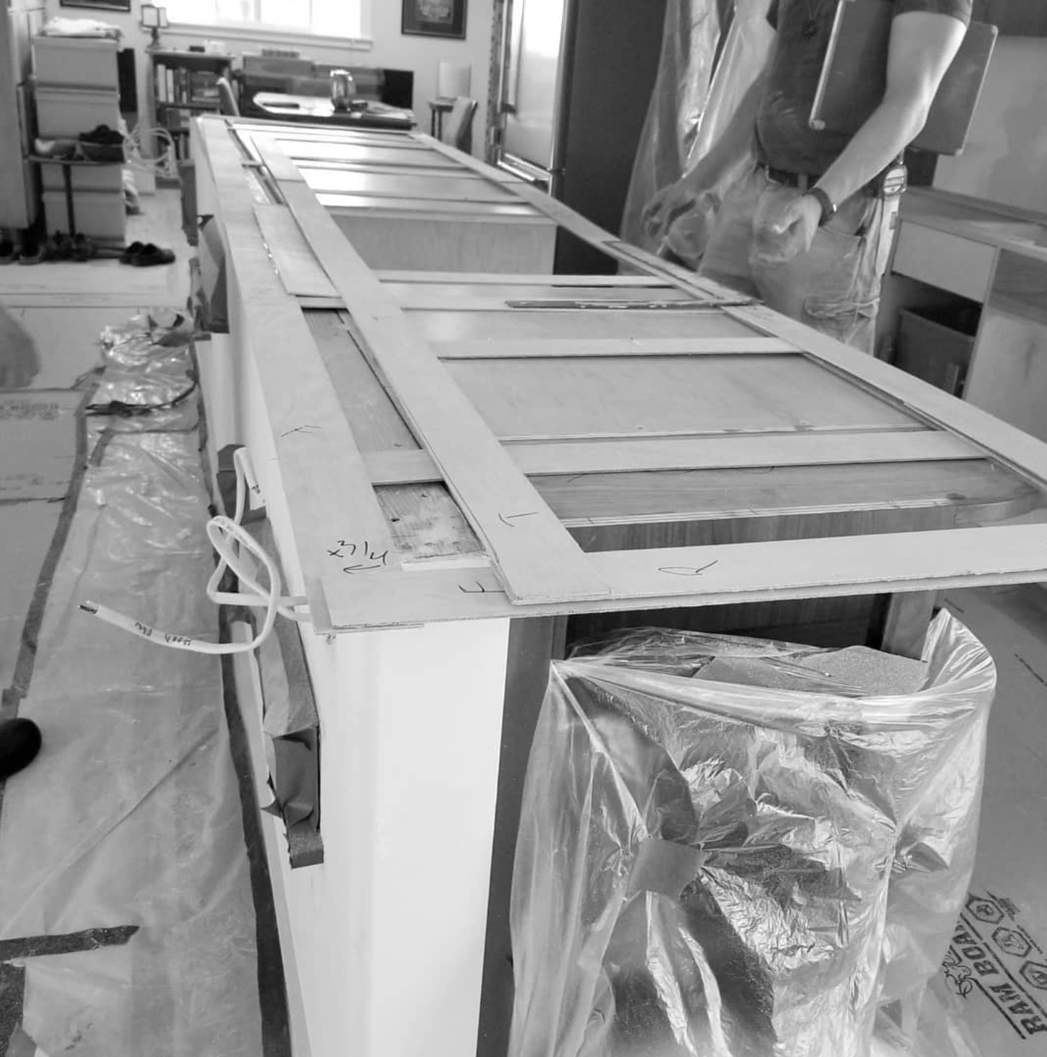
The existing cabinets were in good condition but did not meet the owner’s aesthetics or functional needs. Rather than defaulting to taking these cabinets to the dump, Waldron Designs and the homeowners agreed to donate cabinets, counters, range, hood, and sink to Vashon Barn Salvage, a reuse company on the island that was holding their close-out sale, and I heard that all sold successfully during that sale!
Big thanks to Vashon Barn Salvage and our amazing clients for being open to a donation! I love keeping perfectly good products out of the landfills!


One of our favorite things about working with our amazing clients is the development of amazing friendships, and this project was no exception. Our clients were patient, kind, funny, and introduced us to some fantastic Netflix shows, while spoiling us with some of their amazing homemade ketchup. I don’t think I could ask for anything more.
Not only did I make a friend, but the full crew came to adore this fantastic couple. We could not be more lucky- a fantastic couple who love color, share our deep respect for the environment, and are fun and amazing cocktail mixers to boot!
Thank you to our Palisade Kitchen owners, I look forward to the Palisade Bathrooms!
Waldron Designs, LLC is passionate about designing spaces rooted in their context and responsive to the natural environment. Are you ready to create sustainable permanence with your home?
GET IN TOUCH!